NIH HPC News & Announcements
Interactive storage visualizations for data directories now available on the HPC User Dashboard
Date: 12 July 2021 08:07:00
From: Wolfgang Resch
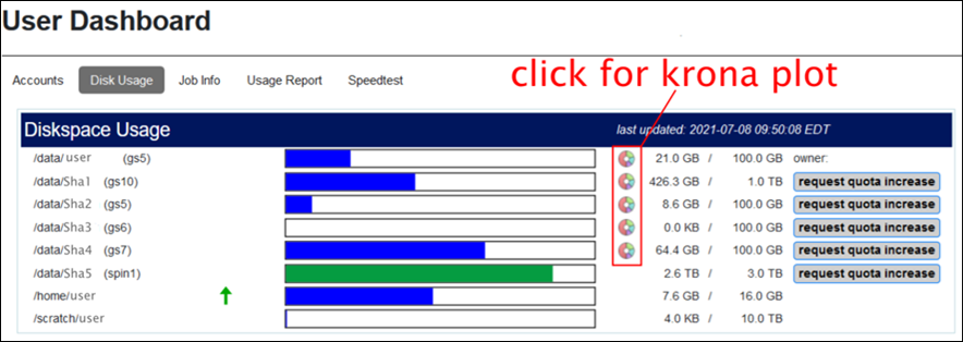
To assist users in managing their data on Biowulf, the HPC User Dashboard now provides Krona-based visualizations of their data directories. These interactive hierarchical maps of data and shared directories will assist users in finding unused or infrequently accessed old data that could be archived. They also provide a simple overview of the storage distribution in individual or shared data directories, and will help users easily identify large subdirectory trees.
Click on the circular icon next to each /data area in the dashboard to see its krona plot.
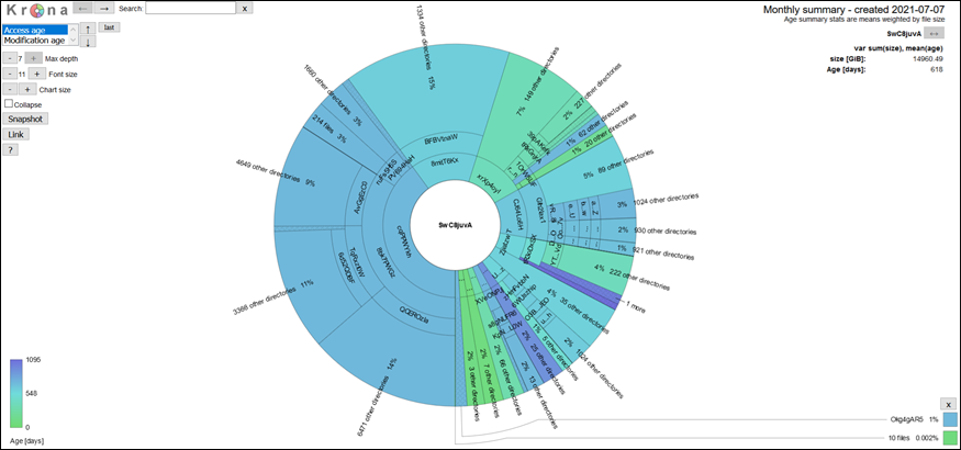
 Screenshot of an anonymous data directory: The size of the slices represents the total size of a directory and the color indicates the size-weighted mean age (access or modification) of the files in the directory. The plots on the dashboard are browsable with summary statistics shown in the top right corner.
 Example visualization
Notes:
Example visualization
Notes:
- Small data directories, directories on some file systems, and /home and /scratch will not have Krona plots
- Plots are updated around the beginning of each month and might not reflect the current state of a data directory
[Last 12 months of HPC announcements]